Come on in and take a seat class, this post is going to get down to the
brass tacks of traditional art instruction. In this post we begin to explore
tips, classic tools and if you’re new here, check out our rare and valuable
educational references in our Library. At The Vintage Inkwell Academy,
the instructional style and content are predominantly derived from tried and
true classic training techniques from a bygone era. Some of this information has
been updated to accommodate either lost/undiscovered knowledge or introduce newly
upgraded techniques. As newer, refined methodologies and tools are discovered, we
will still endeavour to preserve the original source knowledge as much as
possible.
Our goal will always be to provide you with vintage, genuine-article
resources to produce and develop better artists. So, if you want to know what books
and whom Lou Fine, Reed Crandall, N.C Wyeth and J.C.
Leyendecker studied with to get their skills honed razor-sharp, you’ve
come to the right place. Other than publication aids rarely used such as Adobe Photoshop or Illustrator to move content into the
digital world, we will never talk of using drawing tablets, stylus-based
drawing or anything like it. I’m not knocking their use, but digitally produced
content is just not our aim here at the Academy. TVIA offers strictly organic, old-school techniques and knowledge that
would be lost to history if not documented. We work to gather and preserve them
here on our site, and make it available free of charge to all who are
interested. I’m not a teacher, as I’m still learning and developing my skills
in illustration. If anything, I’m an advanced student, virtually mentored by
the best illustrators and teachers I can find.
To me, there’s an energy, vibrancy, soul and expression that’s lost in
straight digital rendering. In the work I’ve seen, there seems to be a noticeable
absence of foundational technical training, with artistic base rules often missing.
Without these basic and required artistic principles in place, you cannot
produce exceptional works that the pros of old achieved. Personally, I find
digital art is simply too detached and too clean. It’s also cold, sterile and impersonal.
By contrast, traditionally produced art has life, energy and profound style in
those lines. The master artists poured themselves into each stroke and it shows.
Nuance and fine details are put there with intention and forethought. The best
thing about traditional organic drawing and painting is that the line will
always tell the truth and reveal any and all artistic inaccuracies. The line
and stroke will never lie to you, nor can they be filtered out or digitally
covered up or altered. It is what it is, in its glory or failure, and that’s
what I like most about it.
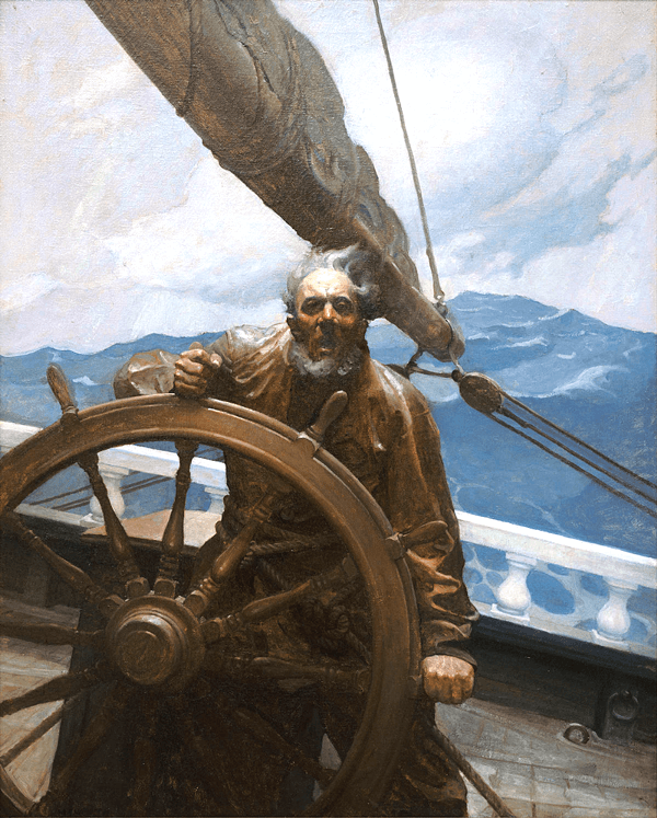
The ‘Sea Captain’ by N.C. Wyeth, you can feel the vitality due to the magnificent life-like composition in this oil painting. The dimensional portrayal of this Captain is so unnervingly real it’s like you are actually aboard the ship as it is all happening.
The artists of old were trained to infuse themselves into the heart and character of their subjects to bring them to life. Take some moments and examine the work of N.C. Wyeth and Dean Cornwell. Look closely and study the form, the style, and the emotive urgency. The flow of the line, the brilliant composition that guides the eye exactly where it should land, and for just how long it should dwell. The subtle interplay of light and how it plays against shade and shadow that powerfully brings the work forward. N.C. Wyeth’s work isn’t just colour and line work… the work breathes… it lives! It engages and draws you into its world where you can feel the heat and cold and smell the scents of the environment. It takes you into that world so that you are a standing witness to the scene transpiring live.
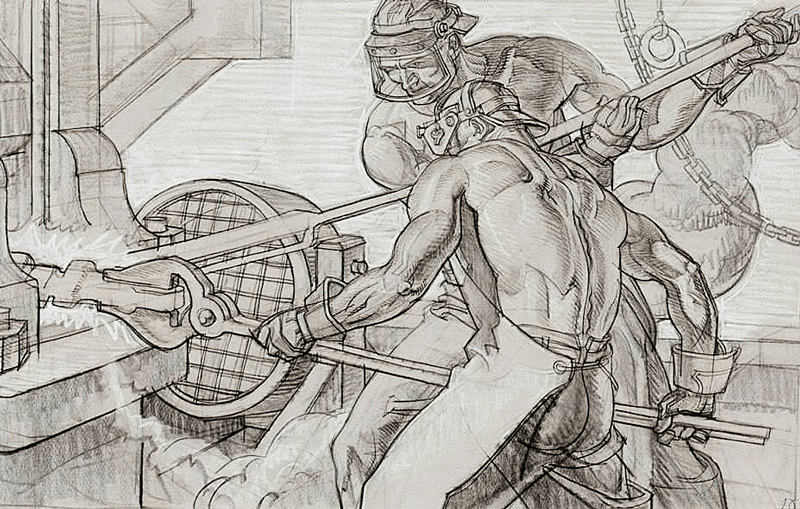
Here’s an outstanding illustration by Dean Cornwell of 2 men working in an iron foundry. The composition and stylised line work here is exceptional. Cornwell vividly captures the heat and careful focus of these men in this dangerous environment.
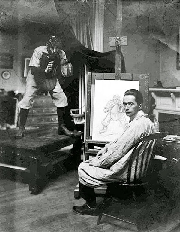
This photo is a rare example of J.C. Leyendecker at work with a baseball catcher model. It dramatizes how and why it’s so imperative to work from a model whenever possible. When models are not available, high-def photographs are the next best. Followed by your imagination backed up by photographic references if possible.
As much as you can, always draw from life and if you
are unable, then fall back on photographs. But remember, nothing is as good as drawing
from live models! Do not use other drawings as references, as they will pull
you away from YOUR interpretation and then you will only be imitating the
original artist’s vision. Carry a sketchbook with you to work, and try to get
in some gesture drawing when you can, as much as you can. We’ll be covering
gesture drawing and its critical importance in the next post.
Keep a medium-sized clipboard with blank copier paper next to your
couch or bed. When you find yourself watching a movie on TV you’ve seen
multiple times, use this as a drawing opportunity. From the screen, start sketching
faces of all kinds, in all manner of emotive states (silent movies are optimal
for this). Also, try and capture a character’s essential gestures of wild
movements in motion. Make sure to consciously exaggerate their actions on paper
to dramatically increase the line vitality.
Always use vitality to transfuse the spirit of that motion and emotion
into the drawing! The great thing about this type of exercise is that it transforms
a typical waste of time into an opportunity to progress your skills. These
screen images are not motionless and static — they move and change rapidly.
This begins training your mind to imprint the action mentally and enable you to
create a quick sketch from it. During this exercise, you are NOT trying to produce
finished drawings. You are merely trying to capture the essence of motion and
emotion live. Do the unfinished drawings suck? Who cares? That’s not the point
of it all. This is a skill and speed building exercise that will produce great
rewards if you are persistent.
These exercises combine speed training, eye-hand coordination and memory
image imprinting. It incorporates what you are learning and have learned in
your anatomical/figure drawing education. Is this easy? No, it’s not at all.
It initially takes practice and concentration until it becomes second nature. If
it were easy, then everyone would be cranking out masterpieces. Not everyone
has the aptitude, the drive, the initiative and the momentum to succeed at
illustration. It is long, hard and committed work. For some more fortunate to
be inherently gifted, it may come easier. However, if you have a powerful need
to express yourself through art, then that is enough to start. If you have
vision, will and discipline, it can sustain you through your course of study.
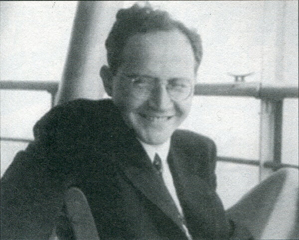
Louis K. Fine, a preeminent and truly gifted illustrator, known for his superb work in Golden-Age comic books. Both he and Reed Crandall elevated the artistic excellence and standards of the comic art medium for years to come.
Imagine young Lou Fine, his left leg crippled by an
earlier bout with Polio, which prevents him from joining the frenetic play of
his friends. He sits gazing out of his tenement window, sadly taking in all the
playful action he sees, but is unable to participate in. Instead, he uses all this
pent up energy, fire and frustration as fuel to learn how to draw. He expresses
all the action he sees before his eyes on paper over and over, refining it each
time and pushing past frustrating mistakes. With whirls of stylistic lines, Fine depicts
all the intensity of movement, explosive energy and agility that he physically
was unable to do. Instead, he amazingly channels it all and articulates it through
his work.
Because modern life has too many distractions and mounting
responsibilities, you must clear them away in order to create time to progress.
Allow the work to compel and captivate you to drive through all distractions! WHAT
IS YOUR GOAL? Analyse and unpack it! Take these thoughts and write
them all down. By bringing them from the intangible into reality, you commit
yourself to acting upon them step-by-step. Stick to completing each and every goal
that you define, or you will go nowhere, and have only yourself to blame.
Prioritise what you need to achieve. Make it your top priority in all
things. Do not allow or tolerate diversions and shut out the nonsense of the
world. Don’t permit distractions to shift your focus in any way from making the
time you set aside as your own. Make up your mind that this is what you NEED to
do, and COMMIT to this idea with all
immediacy and due energy. No one has limitless energy, and there are times
where you won’t want to do anything, especially when employer work has drained
you. This is when you need to dig deep down and overdrive that feeling by
drawing, reading or doing something vital to progress your artistic
mission. Be like a shark and
always keep moving, ALWAYS be moving forward.
Keep… moving… FORWARD!
Brilliant illustrator and painter N.C.
Wyeth spoke of times where he arose in the morning and didn’t feel
like doing anything artistically for the day. Wyeth said that he just pushed himself to the task and before he
knew it, he’d be up and producing better than he had ever thought possible. To
help you along, below is an inspirational reminder I composed that keeps me
going. I turned it into an image that I printed, framed and hung up in my
studio. If you think it might aid you as well, then feel free to copy, print it
out and do the same.
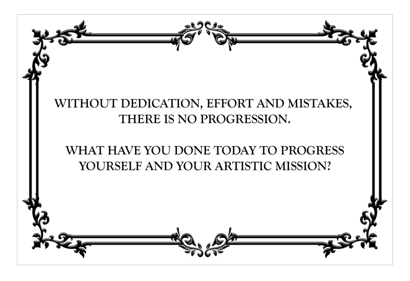
A personal inspirational message, feel free to save, print it outand tack up in your studio as a daily motivator
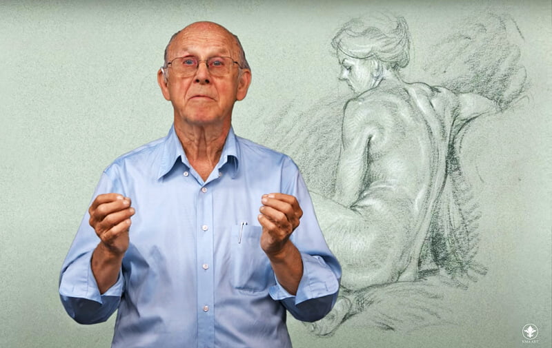
Glenn Vilppu teaching the techniques of Gesture and life drawing. Vilppu derived his fame for his first-rate art instruction harvested from his experience as a highly skilled fine artist, draftsman and painter. You can find him still instructing at the Vilppu Academy and at the New Masters Academy.
Just what does this eloquent phrase by the renowned artist and
teacher Glenn Vilppu mean? Simply, that in illustration or any
creative medium for that matter, creativity should not be bound up by rules. Dynamic
art is knowledge and visual perception, expressed through the acuity of
tools. ‘Tools’, are defined as the
instruments used and deftly manipulated with your amassed skill, to communicate
form, shadow, light, emotion, spirit and very importantly… weight. That compression
and extension of masses against one another, the energetic twists and turns
producing action and contrasting reaction.
Your eyes and hands are tools, as is your
imagination - just as much as the T-Square, pen and pencil are. The tools are merely
the messengers that convey the dream you imagined and delivered into existence.
How frustrating it is when that message is trying to be told, but the tools are
not up to the job? How humbling is that experience, when the only method of
correcting it is to gain knowledge and practice. The object of practice as
repetition is to open those new mental and skill pathways. It acts as the
vehicle of expression formed from what you have learned and digested. Practice
can be tedious work to be sure, but from it, you derive better skills and
technique. The rewards will come via the persistent dedication to your craft. The
driving force in creativity and expression is the freedom to try, to fail and
to keep at it until your style emerges. You develop a system that joins passion
and skill with your unique experiences to express your ideas and vision through
art.
Study, practice and hone your artistic ‘tools’. There is no limit to your creative success!
In proper art instruction, there are logical base rules of structure
and anatomy. These must be learned and adhered to until a degree of artistic
expertise has been achieved. Once the foundation has been mastered to a degree
of proficiency, only then can you take stylistic liberties with them. This is
your creative signature and brand that defines your vision, and promotes it to the
world. Your works merely provide your audience with the lens to view what you
have captured in a moment, and tell its story in an imaged visual form.
Let’s look at art training from the aspect of playing a video game,
where initially everything is unfamiliar at first. There are rules and certain
skills you must use to progress through the game. As you play the game, your
mind catalogues and anticipates moves. Failures become wisdom and repetition coordinates
mind with muscle memory. It’s the repetition, the development of your dexterity
as you struggle through learning the movements of the game pad and navigating
the on-screen challenges. Suddenly, gameplay becomes easier and more fluid. Now
you don’t even think about executing the movements anymore, they just happen automatically
through mind and muscle memory. Now, the focus is to complete the game using
creativity and resourceful imagination to accomplish your missions. The whole
enterprise went from daunting and sometimes frustrating to a flowing, engaging
and now absolutely compelling experience.
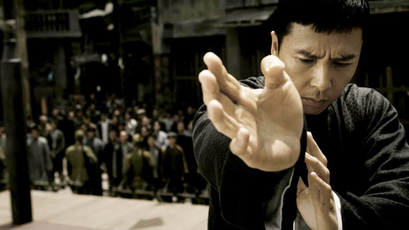
The expression of any creative art lies in your ability to flow like water and connect with the core energy of Chi. It’s that universal life energy that’s central to mastery in the creativity you pursue and it is not limited to the exclusive realm of martial arts.
What is the mysterious secret of art? It’s
just perception and how you look at things. In Chinese martial arts, learning
and repetition is to humble oneself to the universe, to harmonize with Chi, the life essence, the essential flow. Art is very
much the same and if you’re resistant, arrogant, mal-intentioned, angry and frustrated,
you will never enter that flow and become one with it. You have to submit
yourself to its calm, and enter the flow that enables the Chi to course through
you and express itself creatively.
You will know once it happens, because it
resides inside of you and once you sublimate the ego barrier, you allow that
Chi energy to flow along and enhance your abilities. It just happens, as
natural and undeniably powerful as when one falls in love. It sublimates you to
take your place for a moment within that universal force and use it as a
vehicle to express yourself creatively. Now, the next time you go to draw and
that resistance and apprehension surface — stop, relax yourself completely and
change your mind-set and negative perception. Cast aside concern and care - just
breathe in, turn on some flowing music, calm yourself and be carried into that energy
stream.
Content creation has no delusions of where it
needs to be, so take yourself out of its path. Just allow its expression to
take its course through your mind, your vision and your hand. Trust in your
talents and let them play out onto the blank paper, empty canvas or mass of clay.
What are you trying to create? Be that thing, realize it’s dimensions, it’s
inherent life and communicate that artistically.
Bristol Board
In Golden-Age comics, original art is drawn on Bristol Board primarily, as it
is very adaptable to the medium of India inks, washes, coloured inks or marker.
The size dimensions of the board on which the artist drew back then was 12.5” X 18.5” which I like better. I feel this
size provides a bit more landscape in which to explore your vision than the standard
modern size of 10” X 15”.
I’ve used many brands of Bristol board and personally favour and highly
recommend the Strathmore Series 300. I prefer the plate finish rather
than vellum, which I find too toothy for my style and use. It really all
depends upon your preference and the type of art mediums you are using to
compose your work. I find it best to buy the 19″ X 24″ size
and cut it down to the dimensions I require, which gives me 2 sheets per page.

The highly recommended Strathmore’s Series 300 19″ X 24″ Plate Finish Bristol Board. Use the best to become the best and make sure to always obtain and use the finest quality materials.
Brushes
If you plan on using brushes, the one most recommended is, of course, the legendary Windsor Newton Series 7 Kolinsky Sable Brushes for it’s
exceptional point resilience, ink retention and stroke accuracy. The most
common sizes used in comic illustration are #0, #2, #3, and #4. But
again, there is no hard rule, and you should try out whatever suits your needs
artistically. For myself, I really love the performance of the Kolinsky brushes
made by Raphael, as I feel the quality of Windsor
Newton has slightly diminished within the past few years.
The bottom line is that it doesn’t all ride on the
particular brand you settle on. In my early years, when I first started, I was
using more affordable nylon tipped brushes where I learned how to control the
line just fine. It was all how you applied the finesse required to utilize a
lesser quality brush. Lou Fine originally used the cheap
Japanese brushes, miserly purchased by the companies he worked for, and learned
to bend them to his will to produce masterpieces. Ultimately, you can work with
any tool as long as you acknowledge its limitations, navigate around its quirks
and make it work for you.
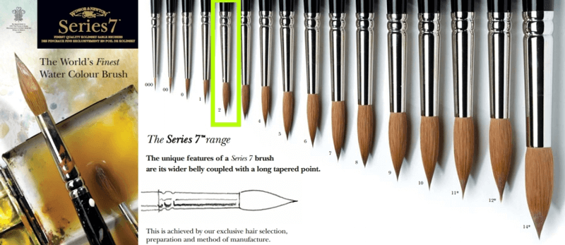
A chart of sizes featured inWindsor Newton’s Series 7 Kolinsky Sable Brushes. By purchasing quality materials it makes the work more enjoyable and easier. Where as brushes of lesser quality will make you work harder struggling to work around the limitations of the lower-grade.
Pen Nibs
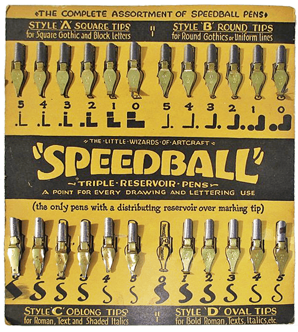
Originally, the major tool of choice in cartooning and comic book art were pen nibs
such as the old stand-by Crow Quill, the versatile Gillott
#170, #404, #303 and #290, Speedball B6, C6 and A5. These traditional
inking nibs are the best for hand lettering and rendering ink over pencil and
produce very satisfying results with practice. There is a diverse array of
calligraphic pen nibs available, so try out different ones for different
effects, styles or results. This is your personal content creation, so develop
your style with these and create your own signature techniques.
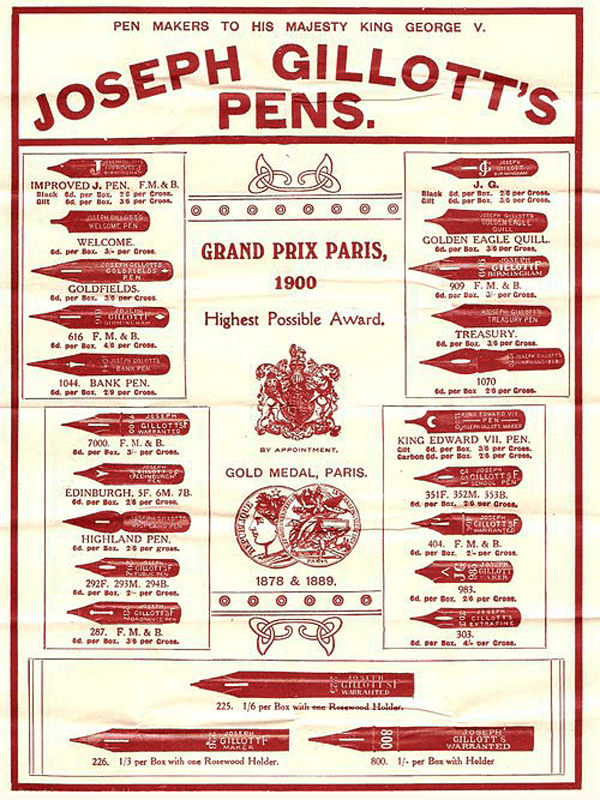
A vintage card of Joseph Gillott’s calligraphic inking pen nibs
A vintage card showcasing Speedball’s calligraphic inking pen nibs
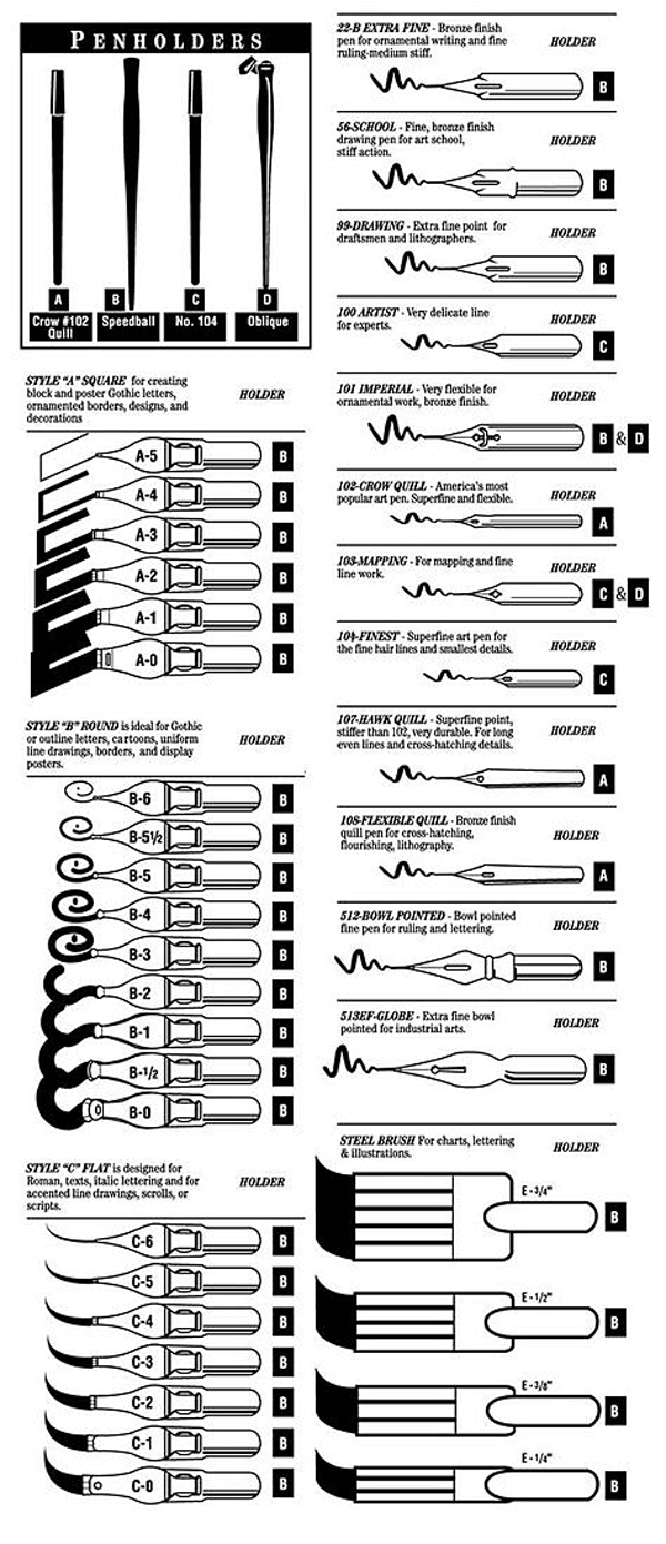
Assorted calligraphic inking pen nibs and a display of their diverse strokes
Ink
Ink is not some inert, liquid art medium. It’s the lifeblood of any pen and ink
illustration, taking it from pencilled framework and imbuing it with power and vitality.
It completes the passage from idea, to form, to the finished inked creation.
The pencils are the process of conception, but the ink is the birth on paper! Traditionally,
India ink has enjoyed long established use for draftsmen’s renderings. There
are many India inks out there and I’ve tried a good many. For a while, I swore
by Higgins Black Magic as the best there was, until its owner
Chartpak, started greedily diluting their product. I had to resort to a trick
of leaving off the cap for up to 2 days in order to condense the ink to a usable
opacity. I finally gave up and moved on to Speedball Super Black India ink,
which is a dense, rich and opaque bliss that I need and recommend highly for
this type of work.
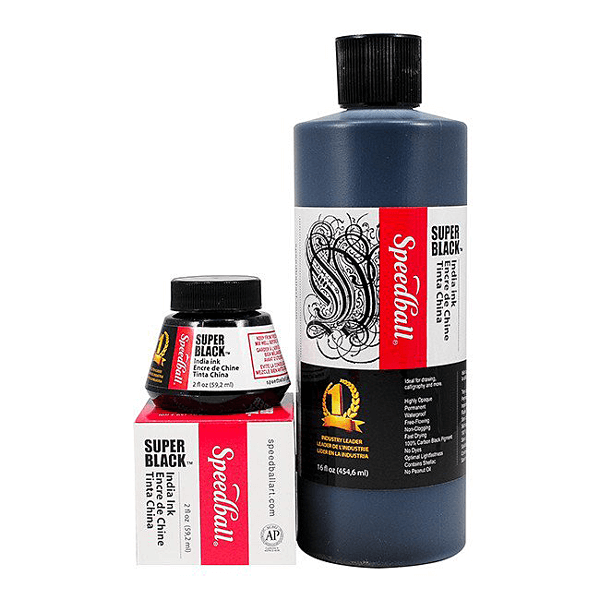
Speedball’s Excellent Super Black India ink, the perfect ink for luxuriously opaque blacks with a rich, smooth flow.
Colours
Vintage Colouring of art for publication was originally performed manually, using Dr.
Ph. Martin's coloured inks, which back then, were not light-fast, much
less waterproof. These problems have now been happily conquered with their revised
line called Dr. Ph. Martin’s Bombay India Inks that come in 2
diverse sets. Set #1 is the standard recommended set, which
should produce most, if not all of the colour variations you should need. Set
#2 is more of a selection of warm and cool colours in the colour spectrum,
so you can purchase either one or both if so inclined.


Dr. PH Martin’s Bombay India Inks Set # 1, lightfast and waterproof with beautiful colour. An absolute must for traditional hand-applied colourisation of your art for publication.
Dr. PH
Martin’s Bombay India Inks Set # 2 lightfast and waterproof with expanded
colour range. Add a life and personality to your work that is difficult to
achieve digitally.
Except for the possibility of using Photoshop for adding
some small distinctive effects, I personally abhor digital colouring. I find
that as it’s commonly used today, instead of being used subtly and sparingly to
enhance the work, it often makes it a garish, distracting, and confusing mess. In
its recurrent state, digital colouring produces an overwhelming colour that’s
too clean, lifeless and dispassionate. It appears as though they are trying to
emulate brash cinematic effects that fail, due to the lack of variations of
light and shadow to produce mood and dimension. Proper comic book colouring is
essential in allowing the pages to breathe, to cleanly display the interplay of
the story with the illustrated content. It’s the mastery of atmosphere that
drives dramatic visuals. You can see this clearly in the early works of Michael
Kaluta or Bernie Wrightson.
All that being said, I’m keeping an open mind to hoping that someday digital
colouring can evolve into something new, alive and vibrant.
Comic Book Colouring Tips and Tricks Episode 10: Old School Style by Nathan Lumm
In its current incarnation, I still feel that overall, digitally composed
works are a bit sterile. So, I asked myself why, and then it came to me. The vitality
is in the revelation of seeing the small errors in the work, and the human imperfections
are what spur the interest. You can take an exact pencil drawing of a N.C.
Wyeth painting, then scan and colour it in using Photoshop and it renders it
lifeless. Take that same original Wyeth and examine it closely. Note the varied
textures on canvas, and the colour values he uses to produce organic dynamics
of light and shade. Take in each stroke he used to depict the figures, create the
background and saturate emotional content into the scene.
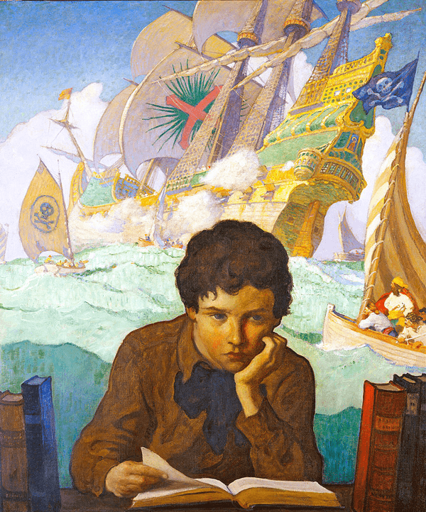
N.C. Wyeth’s ‘The Storybook’ oil painting, a digital version could never impart the life and spirit in this work. If you want vibrancy and energy in your creative content, traditionally trained and used tools are the way to go.
Now step back a bit, and view it from a medium distance. What do you see? The details and overall impact comes alive with what Wyeth infused of himself consciously and unconsciously into the work. This is the difference! You must always form that connection and inject yourself into your creative content. Define the characters you are drawing and become them on paper, so you can transfer that emotional power into the content. This is the attainment of full expression into the work that drives the audience to take notice. This catches the viewer’s eye and holds it, then guides them through this new world you created. If you’ve done the job correctly, the work will resonate, captivate and move your audience.
Well, there’s the bell class, see you next time. Before you go, I want to extend special thanks to Neil McAllister of the website:
https://neilmcallister.com
whose site has some very cool writings and resources. He was magnanimous enough to share a resource that I turned into a PDF and added to TVIA’s Library entitled,
A Trip to the Sausage Factory by Neil McAllister – The Comic Book Creation Process
.
Do not be apprehensive or put off from where you are now artistically - we all had our start from exactly the same place and it’s only the destination that’s truly important. Your journey is your own and your development happens on its own time, dependent only on your drive and consistency of progressive study. Your homework is in the
Library
in the top menu. For great instructional tips and inspirational fire, I recommend you read
The Teachings of Howard Pyle and An Evening in the Classroom of Harvey Dunn
.
Until the next time…
Special thanks to Bob Keough for his exceptional editorial assistance.
created with
WordPress Editor .